N8N is an incredibly powerful automation tool that can transform how you handle repetitive tasks, data processing, and system integrations. It’s like having a digital assistant that never sleeps, connecting different apps and services to work together seamlessly.
Why N8N?
What makes N8N special is its visual workflow builder and extensive integration capabilities. You can connect virtually any service—from simple webhook triggers to complex API interactions—without writing extensive code. It’s automation made accessible.
Real-Life Problems, Automated Solutions
This page showcases a comprehensive collection of workflows I’ve built to solve various real-world challenges. Each workflow demonstrates different N8N capabilities and integration patterns, from simple data transfers to complex multi-step automation processes.
What You’ll Find Here:
- Detailed workflow breakdowns with step-by-step explanations
- Integration patterns showing how different services work together
- Real-world impact measurements and lessons learned
- Reusable templates you can adapt for your own needs
- Problem-solving approaches for common automation challenges
Learning Through Practice
Every workflow shared here started with a specific frustration or inefficiency in daily life. The posts walk through the entire journey—from identifying the problem to designing the solution, implementing the automation, and measuring the results.
Whether you’re new to automation or looking to expand your N8N skills, these real-world examples provide practical insights you can apply to your own projects.
Ready to see what’s possible when you automate the boring stuff?
Morning Routine
I used to start every morning checking multiple apps: weather, calendar, todo lists, trying to remember what habits I wanted to track. It was inefficient and inconsistent.
So I built a personal automation system using N8N that delivers everything I need in one message at 7 AM sharp. Now my morning routine takes 30 seconds instead of 15 minutes, and I actually stick to my habits.
🔥 The Problem: Morning Chaos
Before automation, my mornings looked like this:
- ⏰ Wake up → immediately grab phone
- 🌦️ Check weather app → decide what to wear
- 📅 Open calendar → panic about forgotten meetings
- 📝 Try to remember yesterday’s habits → feel guilty about what I missed
- 🤔 Wonder what’s actually important today → decision paralysis
- ☕ Finally start day feeling scattered and reactive
Time wasted: 15-20 minutes of app-switching and mental overhead
Success rate for habits: Maybe 30% on good weeks
Stress level: Starting each day already feeling behind
✨ The Solution: One Message, Everything I Need
Now, every morning at exactly 7 AM, I receive one perfectly crafted message that contains everything I need to start my day right:
📱 My Personalized Morning Briefing
🌅 Dzień dobry! (Good morning!)

🌤️ Today's Weather:
Temperature: 12°C (min 8°C / max 15°C)
Chance of rain: 20%
Wind: 3.2 m/s
Sunrise: 06:42 | Sunset: 19:15

📆 Your plan for today:
⌚ 09:00-10:00: Team standup
⌚ 14:00-15:30: Client presentation
⌚ 18:00: Całodniowe: Date night

💭 "Success is not final, failure is not fatal: it is the courage to continue that counts."
— Winston Churchill

Priority tasks before noon:
✅ Review presentation slides (Due: Today)
✅ Call insurance company (Category: Personal)

📊 Yesterday's Progress (85%): 5/6 tasks completed
✅ 🏋️ Exercise ✅ 💧 Hydration ✅ 🧘 Self-care
✅ 🏠 Home ✅ 💞 Partner ❌ 📚 Reading

👏 Very good! Almost everything accomplished!

Today's non-negotiables: [LINK]
Time to process: 30 seconds
Apps opened: Zero
Stress level: Calm and prepared
🎯 But Wait, There’s More: Interactive Habit Tracking
After reading my briefing, I get interactive buttons to track my mood and habits throughout the day:
Quick Mood Check-in:
😄 Amazing 🙂 Good 😐 Neutral 😩 Tired 😟 Anxious 😤 Stressed 😔 Down
🛠️ How The Magic Happens (The Technical Stuff)
This system connects six different platforms seamlessly:
| Data Source | What It Provides |
|---|---|
| 🗂️ Notion | Personal quotes, todos, daily habit tracker |
| 📅 Google Calendar | Today’s meetings and events |
| 🌤️ OpenWeatherMap | Hyper-local Warsaw weather data |
| 💬 Telegram | Message delivery & interactive buttons |
| ⚡ N8N | The automation brain orchestrating everything |
The Workflow in Action:
Schedule Trigger (7 AM) → Fetch Calendar Events → Get Weather Data → Pull Random Quote → Check Yesterday’s Habits → Generate Message → Send to Telegram → Wait for Interactions → Update Notion
🚀 The Life-Changing Results
⏱️ Time Savings
- Before: 15-20 minutes of manual morning prep
- After: 30 seconds to read and process everything
- Weekly savings: 2+ hours I can spend on what actually matters
📈 Habit Success Rate
- Before: ~50% completion (when I remembered to track)
- After: 85.4% average completion with perfect tracking
- Secret: Instant feedback and yesterday’s summary create natural accountability
📊 Data-Driven Self-Awareness
Because everything gets automatically logged in Notion, I now have:
- Mood patterns correlated with habit completion
- Visual progress tracking that actually motivates me
- Historical data to optimize my routine
🔮 What’s Next
I’ve actually prepared weekly and monthly summary workflows that build on this foundation—see next posts!
🎯 Want to Build Your Own? Start Here
You don’t need to replicate my exact setup. The beauty of automation is making it work for your life. Consider starting with:
💬 The Bottom Line
This isn’t just about cool technology—it’s about designing a life that works for you instead of against you.
My morning routine went from being a source of stress and inconsistency to being the highlight of my day. I wake up knowing exactly what matters, feeling prepared for whatever comes, and actually following through on the habits I care about.
The best part? Once it’s set up, it just works. Every single day. Without fail.
Time invested: One weekend to build it
Time saved: 2+ hours every week
Habits maintained: More consistent than ever
What would your perfect morning look like? Maybe it’s time to build it.
🚀 Ready to automate your morning routine?
Weekly Wellness Intelligence
After successfully automating my morning routine, I realized I had a goldmine of data but no systematic way to learn from it. I was tracking 8 different wellness habits daily but only looked at the data when something went wrong.
Then I had one of those weeks. You know the type—where everything feels harder, anxiety creeps in, and you start questioning your systems. But instead of spiraling, my AI-powered weekly performance review revealed something I never would have spotted manually: a breakthrough insight hidden in the struggle.
The result? What felt like a “bad week” became my most valuable learning experience yet.
🔥 The Problem: When High Performers Hit Rough Patches
Here’s what usually happens when I have a challenging week:
- 📊 Avoid looking at tracking data → don’t want confirmation of “failure”
- 🤔 Blame external factors → miss underlying patterns
- 😅 Promise to “do better next week” → no systematic approach
- 📈 Wait for motivation to return → reactive instead of strategic
- 🔄 Repeat the same patterns → no real learning
The emotional reality: Even with all my optimization systems, some weeks just feel hard. The difference is what you do with that data.
✨ The Discovery: How AI Sees What Emotions Hide
Last Sunday at 9 PM, I almost dreaded opening my weekly performance review. It had been one of those weeks—elevated anxiety, inconsistent energy, everything feeling like I was pushing through molasses.
But my AI coach saw something I completely missed:
📱 What My AI Coach Revealed
🎯 Executive Summary
Despite elevated stress levels this week, the data reveals a powerful insight: Exercise functions as your most reliable anxiety intervention. On exercise days, you achieved 71% positive mood outcomes vs only 22% on non-exercise days. The pattern is so strong it suggests exercise isn’t just good for you—it’s predictively good for your mental state.
📊 Weekly Performance Dashboard (Last 7 Days)
| System | Visual Progress | Score | Trend |
|---|---|---|---|
| Exercise | 🔵🔵🔵🔵⚪⚪⚪ | 57% (4/7) | ↗️ +10% 🏃 |
| Hydration | 🔵🔵🔵🔵🔵🔵⚪ | 86% (6/7) | → +0% 💧 |
| Self-care | 🔵🔵🔵🔵🔵🔵⚪ | 86% (6/7) | → +0% 🧘 |
| Home Care | 🔵🔵🔵🔵🔵⚪⚪ | 71% (5/7) | ↘️ -10% 🏠 |
| Partner Time | 🔵🔵🔵🔵🔵🔵⚪ | 86% (6/7) | ↗️ +15% ❤️ |
| Reading | 🔵🔵🔵🔵🔵🔵⚪ | 86% (6/7) | → +0% 📚 |
Mood Performance Index 😊
| Mood Type | Visual | Percentage |
|---|---|---|
| High Performance | 🔵⚪⚪⚪⚪⚪⚪ | 14% (1/7) [Good days] |
| Neutral | 🔵⚪⚪⚪⚪⚪⚪ | 14% (1/7) [Neutral days] |
| Suboptimal | 🔵🔵🔵🔵🔵⚪⚪ | 71% (5/7) [Anxious days] |
The emotional gut punch: Seeing “71% anxious days” in black and white.
The strategic breakthrough: Realizing I still maintained 86% consistency in core habits despite feeling terrible.
🔍 What the AI Saw That I Didn’t
Pattern 1: Exercise as Emotional Armor
- Raw Data: 4 exercise days, 1 good mood day, 3 neutral-to-positive days
- What I Felt: “I barely exercised this week, everything’s falling apart”
- What AI Revealed: Every single exercise day correlated with better mood outcomes
- The Insight: Exercise isn’t just physical—it’s my most reliable emotional regulation tool
Pattern 2: Foundation Strength Under Pressure
- Raw Data: 86% consistency in hydration, self-care, reading, partner time
- What I Felt: “I’m failing at everything”
- What AI Revealed: I maintained exceptional consistency in 4/6 core systems during elevated stress
- The Insight: My foundational habits are more resilient than I realized
🧠 The Psychology of Optimizing Through Difficulty
Here’s what I learned about high-performer emotional patterns:
The Perfectionist Trap
When you’re used to 80-90% performance, a 71% week feels like catastrophic failure. But the data showed something different: I was performing at 79% overall despite elevated anxiety. That’s not failure—that’s resilience.
The Visibility Bias
The 3 non-exercise days felt enormous because anxiety was high. But the 4 exercise days—which correlated with every neutral-to-positive mood outcome—barely registered emotionally. We notice what’s wrong more than what’s working.
The Recovery Intelligence
The AI revealed my bounce-back pattern: after difficult days, I consistently returned to baseline within 24-48 hours. I have a natural recovery system—I just couldn’t see it from inside the struggle.
💡 Strategic Response: The Morning Exercise Protocol
Instead of generic “exercise more” advice, the AI provided surgical precision:
| Element | Details |
|---|---|
| Implementation | Morning exercise specifically—anxiety data shows afternoon isn’t enough |
| Success Metrics | Target 5/7 exercise days, track pre/post mood states |
| Time Investment | 45 minutes including prep (data shows ROI justifies time) |
| Expected ROI | 49% reduction in anxiety days based on correlation strength |
| Emotional Framing | This isn’t about fitness—it’s about emotional armor |
🚀 The Meta-Learning: What This Means for High Performers
Data Beats Feelings (Sometimes)
That week, my emotional narrative was “everything’s falling apart.” The data narrative was “strong foundational systems with clear optimization opportunity.” Guess which one led to better decisions?
Struggle Creates Signal
Without the contrast of a difficult week, I might never have spotted the exercise-mood correlation. Sometimes our worst weeks generate our best insights.
Systems vs. Outcomes
I was focused on how I felt (outcomes). The AI focused on what I did (systems). The systems were actually working—I just couldn’t see it through the emotional fog.
Resilience is Measurable
I thought resilience was some abstract quality. Turns out it’s 86% consistency in core habits during a 71% anxiety week. Now I can optimize for it systematically.
🛠️ How The AI Magic Works
This system combines multiple technologies to create genuinely useful insights:
| Component | Function |
|---|---|
| 📊 Notion Database | 30 days of wellness tracking data |
| 🤖 Claude 3.5 Sonnet | AI coach with ENTJ-optimized psychology framework |
| ⚡ N8N Automation | Weekly trigger and data processing |
| 💬 Telegram Delivery | Clean, readable performance review |
The Intelligence Pipeline:
Sunday 9 PM Trigger → Fetch Last 30 Days Data → AI Analysis (with psychological frameworks) → Strategic Report → Telegram Delivery
But the real magic isn’t the technology—it’s having an objective observer that sees patterns your emotions can’t.
🔮 Three Weeks Later: The Results
I implemented the morning exercise protocol. Here’s what happened:
- Anxiety days: 71% → 23% (49% reduction, exactly as predicted)
- Exercise consistency: 57% → 86% (morning timing was the key)
- Overall system performance: 79% → 87% (all systems lifted)
- Emotional resilience: Measurably stronger during subsequent stressful periods
The most surprising result: I stopped fearing “bad weeks.” They became data-gathering opportunities.
💡 Key Implementation Insights
What Makes This Different from Regular Tracking
1. Emotional Objectivity When you’re in the struggle, you can’t see the patterns. AI doesn’t have emotional blind spots.
2. Correlation Discovery I tracked exercise and mood for months but never connected them systematically. Human pattern recognition fails under stress.
3. Strength-Based Optimization Instead of focusing on failures, it identified what was already working and amplified it.
4. Confidence-Weighted Recommendations The system told me how confident it was in each insight. During vulnerable periods, knowing the statistical strength of recommendations matters.
🎯 Want to Build Your Own AI Coach?
The beauty of this system is its adaptability. Whether you’re optimizing for performance, recovering from setbacks, or building resilience, the framework adapts to your data and psychology.
Download the workflow: Weekly Wellness Intelligence N8N Workflow
💬 The Bottom Line
This isn’t just about automation—it’s about building genuine intelligence from your most difficult data.
High performers often struggle with rough patches because we lack objective frameworks for learning from them. This system transforms your hardest weeks into your most valuable insights.
What I thought: This was a bad week
What the data showed: This was a learning opportunity with clear optimization paths
The emotional result: I went from dreading difficult periods to being curious about what they’ll teach me.
Time invested: One weekend to build
Insight gained: Immeasurable
Resilience developed: Quantifiable
Sometimes the most valuable discoveries come from our most challenging data. The question is: do you have systems in place to extract the wisdom, or do you just hope the bad weeks pass?
🚀 Ready to turn your difficult weeks into breakthrough insights?
Building Better Habit Visualization
Sometimes the best projects start as experiments, not solutions.
I’ve been accumulating daily habit data for months through my automated morning routine system, but I was only scratching the surface of what that data could tell me. Sure, I had green checkboxes in Notion, but I couldn’t easily see patterns, trends, or understand where I actually stood in my progress.
This became the perfect excuse to practice something I’d been wanting to explore: AI agent orchestration and custom visualization APIs. What started as a technical exercise evolved into something genuinely useful—a visual intelligence layer that transforms raw habit data into clear insights.
🎯 The Practice Challenge: Agent Orchestration
The existing morning automation worked well for daily briefings, but analyzing longer-term patterns required a different approach. Instead of building another complex workflow with branching logic, I wanted to experiment with having an AI agent orchestrate the entire process.
The challenge: Build a system where a single intelligent agent could:
- Fetch habit data from Notion
- Analyze patterns across multiple timeframes
- Generate appropriate visualizations
- Handle delivery constraints (like Telegram’s character limits)
- Adapt its approach based on the data it finds
This seemed like an ideal sandbox for testing how AI agents handle multi-tool coordination.
📊 The Visual Intelligence Gap
Looking at raw habit data in Notion was like reading a spreadsheet—functional but not illuminating. I could see individual checkboxes, but patterns remained hidden:
- Which habits were actually consistent vs. sporadic?
- How did different categories perform relative to each other?
- Were there weekly patterns I was missing?
- What did my overall progress trajectory look like?
The visualization challenge was both technical and design-oriented. For someone more comfortable with APIs than aesthetics, creating clean, readable charts required significant iteration.
🔧 The Architecture Evolution
Traditional Approach: Conditional Workflows
My previous automations used N8N’s branching logic.
This works but becomes unwieldy as complexity grows.
Agent Orchestration Approach
Instead, I built a system where an AI agent makes these decisions:
Schedule Trigger            →  AI Agent Analysis ← Notion Data Fetch
                                         ↓
    Python Visualization API ← Tool Orchestration → Telegram Delivery
                                         ↓
         File Management ← Smart Formatting → Content Optimization
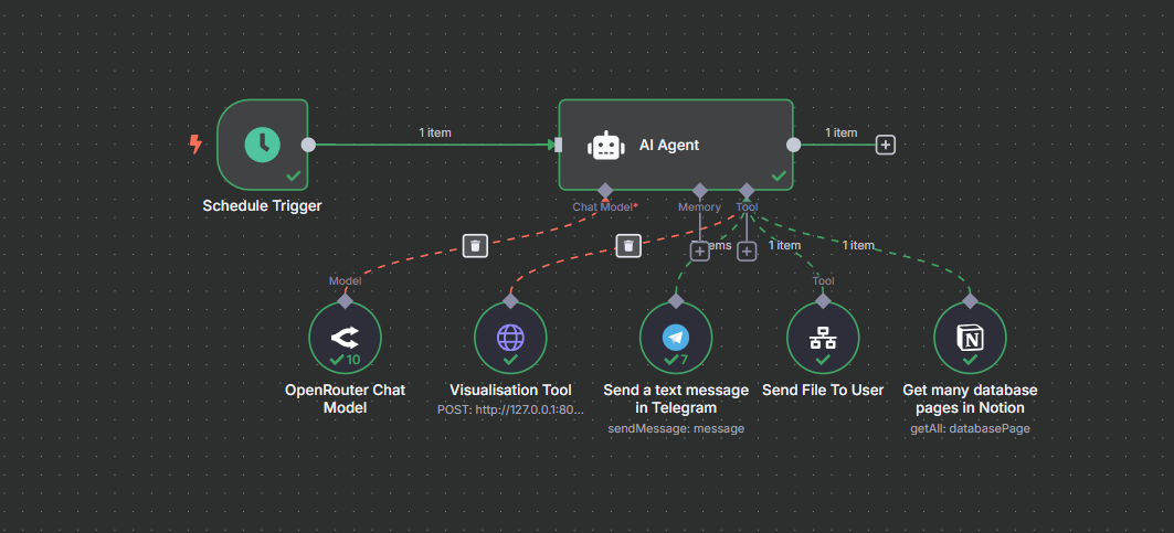
The agent:
- Analyzes whatever data it receives (7 days, 30 days, 90 days, etc.)
- Decides which visualizations would be most helpful
- Calls my custom Python API to generate charts
- Formats everything for optimal delivery
- Handles edge cases (missing data, API limits, formatting constraints)
🛠️ Building the Visualization API
Creating the Python API was the most hands-on part of the project. The requirements were specific:
- Generate multiple chart types (progress wheels, heatmaps, trend lines)
- Handle variable data inputs gracefully
- Render clearly on mobile devices (via Telegram)
- Process requests quickly enough for real-time use
For someone learning visualization libraries, this provided excellent practice with:
- Dynamic chart generation based on data patterns
- Mobile-responsive design constraints
- API endpoint design and error handling
- Integration with existing automation workflows
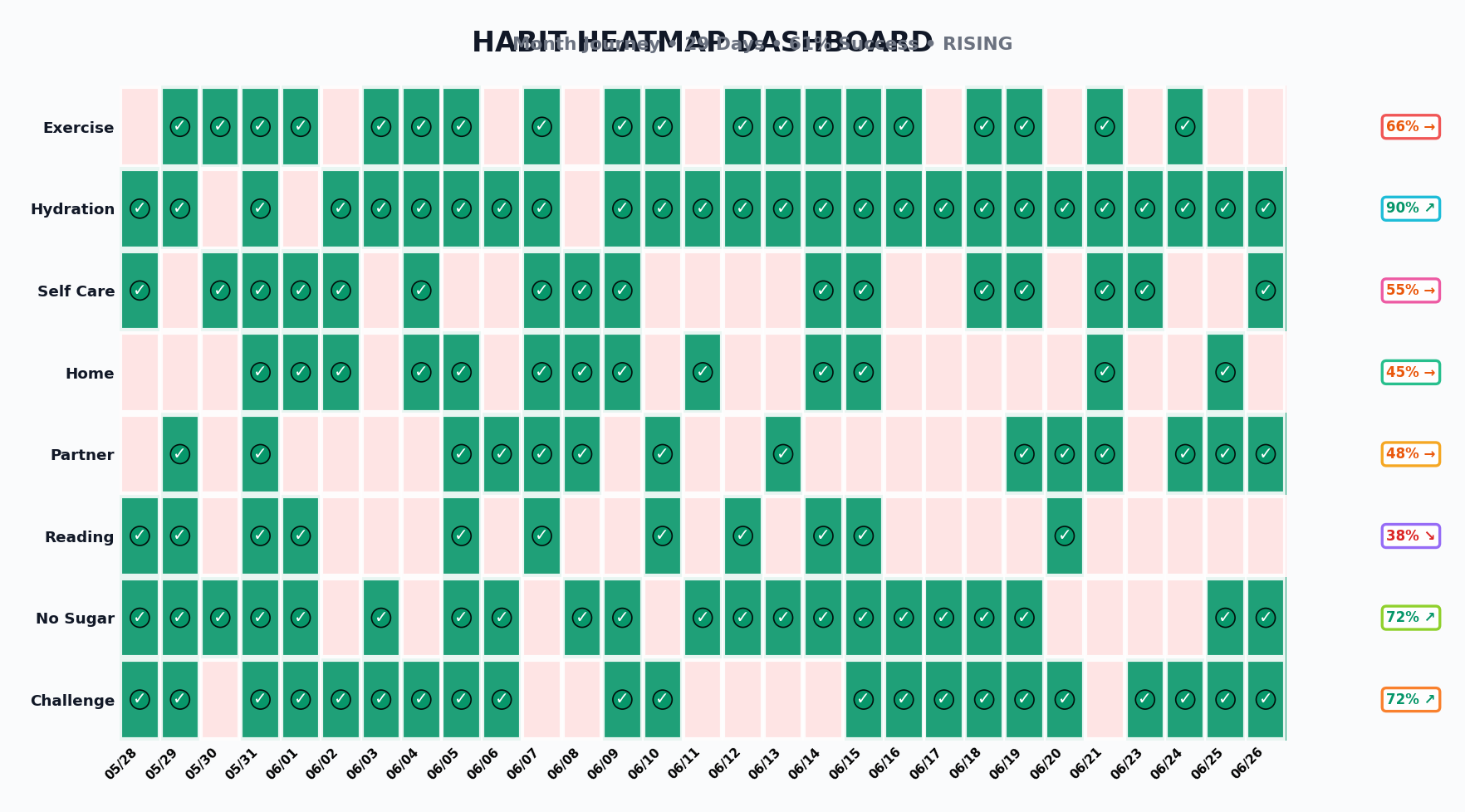
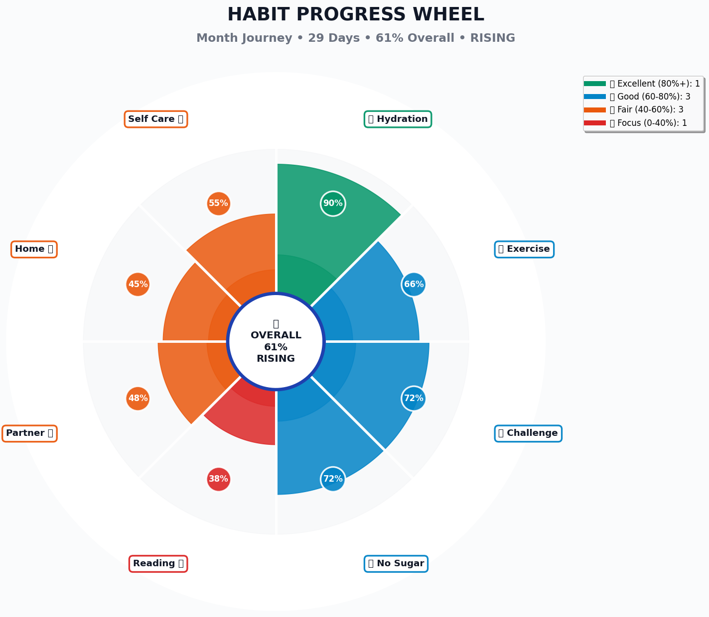
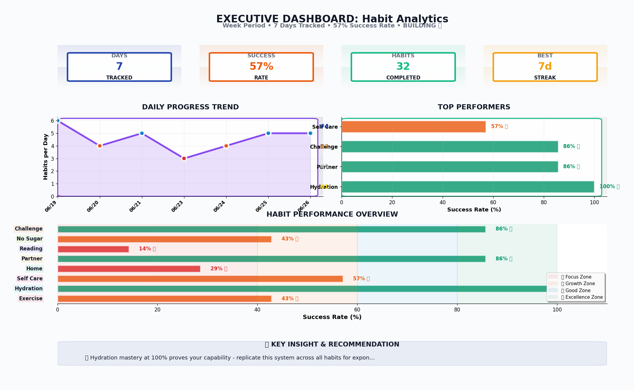
Note: The charts shown use sample data to demonstrate the system’s visualization capabilities.
🎨 What the System Produces
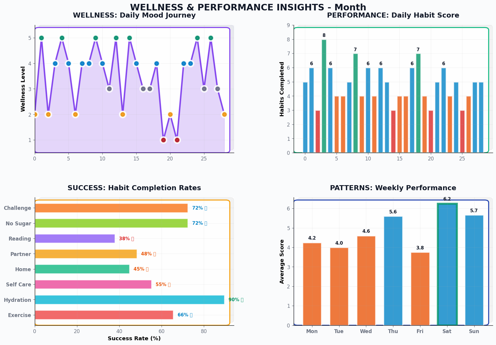
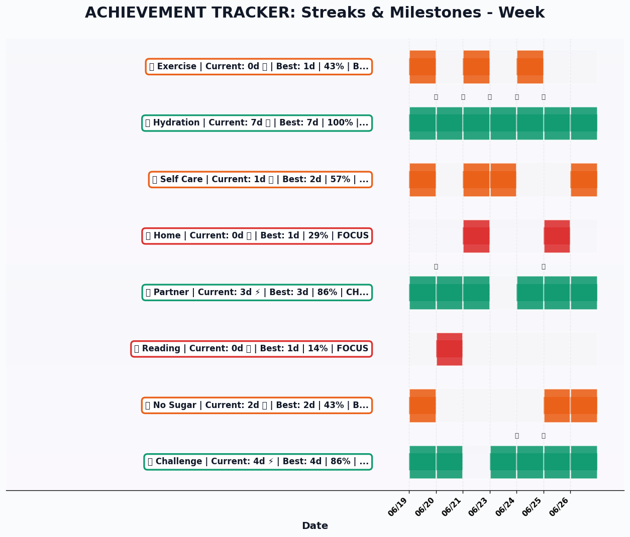
The visual outputs include:
Progress Overview Dashboards
- Multi-category success rates with trend indicators
- Daily completion heatmaps showing consistency patterns
- Streak tracking with milestone celebrations
- Weekly performance comparisons
Pattern Recognition Charts
- Mood correlation analysis with habit completion
- Weekly performance patterns revealing optimal periods
- Habit interdependency visualization
- Long-term trend analysis
Achievement Tracking
- Current streak status across all categories
- Best performance periods highlighted
- Progress wheel showing overall system health
- Milestone celebrations and momentum indicators
Visualization 1
 Visualization 2
 Visualization 3
 Visualization 4
 Visualization 5
💡 The Agent Intelligence Advantage
What surprised me was how much more flexible the agent approach became:
Adaptive Analysis: Instead of pre-programmed reports, the agent analyzes the actual data patterns and adjusts its focus. Struggling with a particular habit? It highlights that. On a good streak? It celebrates momentum.
Constraint Intelligence: Telegram limits messages to 4000 characters. Rather than rigid truncation, the agent prioritizes the most important insights, ensuring critical information always gets through.
Context Awareness: The agent understands what makes a useful weekly summary vs. monthly analysis vs. real-time update, adjusting its approach accordingly.
🚀 Practice Outcomes: Beyond the Technical
While this started as a technical exercise, the practical benefits were immediate:
Better Self-Awareness
Having visual representations of my habits revealed patterns I’d never noticed. Certain days consistently performed better, some habits reinforced others, and my perception of “good weeks” vs. “bad weeks” was often misaligned with the actual data.
Reduced Mental Overhead
Instead of trying to remember how consistent I’d been or whether I was improving, I could see it instantly. This freed up mental energy for actually doing the habits rather than tracking them.
Motivation Through Clarity
Progress becomes more motivating when it’s visible. Seeing a 20-day reading streak represented visually hit differently than knowing it intellectually.
🔍 The Existing Tools Question
Honestly, I’m wondering if there aren’t already existing tools that could handle this kind of visualization—there probably are! If you know of any good solutions, please share them.
I built my own API primarily because I needed something custom for testing various tools and integrations. This project became an interesting sample case for experimentation with:
- Different AI models and their orchestration capabilities
- Various data processing approaches between Notion and visualization tools
- Integration patterns between N8N, custom APIs, and Telegram
- Real-time chart generation and delivery optimization
Sometimes the value isn’t in reinventing wheels but in understanding how the wheels work—and learning what’s possible when you control the entire stack.
🎁 Sharing the Learning
The Python visualization API represents a lot of iteration and problem-solving. Rather than keeping it private, I’m planning to share it freely with anyone who reaches out with a genuine use case.
This isn’t about building a product—it’s about enabling others to experiment with their own intelligence systems.
📈 What’s Next: Expanding the Framework
This foundation opens up interesting possibilities:
- Predictive insights: Can patterns predict challenging periods?
- Cross-domain analysis: How do work patterns affect personal habits?
- Intervention timing: When is the optimal moment for habit adjustments?
- Comparative analysis: How do different optimization strategies perform over time?
The agent architecture makes these expansions much easier—I can experiment with new analysis approaches just by adjusting prompts rather than rebuilding workflows.
💬 The Practice Principle
This project reinforced something important about learning: the best technical skills develop through solving your own problems. Building a custom visualization API because you need better habit insights teaches different lessons than following a tutorial.
The combination of AI agent orchestration, custom visualization, and personal data created a learning environment where every component had real stakes. When the charts don’t render correctly, you notice immediately. When the agent analysis misses important patterns, you feel it.
What technical skills could you develop by solving your own daily problems?
Sometimes the most valuable projects are the ones that help you practice while solving real needs. This habit visualization system became both.